
Media Queries
posted April 20, 2011 # 0 Comments
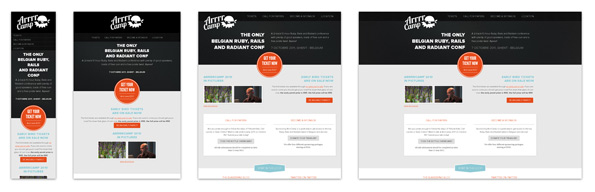
If you're looking for a bit of design inspiration that will kick your butt into gear into designing a flexible site for multiple screen sizes then look no further than Media Queries; a repository of designs that intelligent adapt to wider screens, somewhat smaller screens and very small screens. There are pages upon pages of great examples to check out - maybe even some familiar faces.
Hat tip, Daniel Box.
Hat tip, Daniel Box.