posted March 16, 2011 #
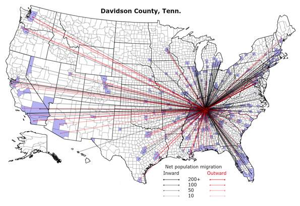
Assuming that you know the county of a city you'd like to live in, this
interactive map is pretty interesting. It shows the inbound and outbound movement from all US counties to all destinations. The in/out movement for Nashville looks to be about equal, the same can not be said for larger cities such as Austin or San Francisco. It's actually far more revealing to pick a random county in the midwest and see how far the destinations
don't go.
via
Chad.