Evolving Dropbox
posted October 5, 2017 #
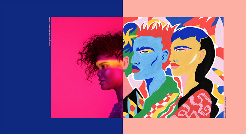
Dropbox's primary functionality isn't very sleek to talk about - sync your files and/or share files to just about anyone. Punching that up and focusing on all of the creative materials that go into a Dropbox is a wise move. It's not a far cry from Mailchimp - a fairly boring base functionality but an extremely fun and interesting marketing campaign.
I've seen some dissent around people think it looks ugly or is a weird move for the company but I think it's a great idea. It also has had zero effect on the actual application (they haven't even updated the logo) and I doubt it will. Huge congrats to Aaron Robbs and Nicholas Jitkoff for the fine work.