
Contrast Rebellion
posted August 15, 2011 # 0 Comments
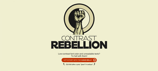
There is much that I love about the Contrast Rebellion - the site design, the simple message campaigning for higher contrast in websites and, unsurprisingly, the readability. What I don't love is that their examples of sites in the wild using high contrast are all black on white (or white on black). This seems to work against the idea that "contrasty dark text can look equally good" because it implies that you really don't have any palette to work with. Aside from that, I'm a fan.